SaaS for Real Estate Management
Siemens Evolutioner UX Redesign
At Siemens, I worked on Evolutioner, an internal SaaS platform used by real estate managers for handling tickets, managing property requests, overseeing contracts, and handling administrative tasks. The platform was essential but had significant usability issues that frustrated users and impacted productivity.
As the sole Product Designer, I was tasked with transforming this complex system to improve its usability and efficiency, focusing particularly on the ticket management process.
Primary Goal: Make the platform more intuitive and efficient for users.
Key Objectives
Reduce Friction: Many users struggled with ticket creation and management. My goal was to streamline these workflows and make complex actions simpler to perform.
Decrease Support Inquiries: Frequent usability challenges led users to seek help from support teams. Improving usability was key to reducing these inquiries.
Enhance User Satisfaction: The platform’s navigation and interactions needed rethinking to make the system easier to use and ensure that users could accomplish tasks confidently and efficiently.
Main Challenges
Complexity of Tasks: With numerous actions and options on each page, the platform felt overwhelming, and it was difficult to find the right options quickly.
Navigation Issues: Navigation didn’t clearly indicate where users were, making it hard to orient themselves, which created friction for task completion.
Inconsistent UI Elements: There was a lack of visual hierarchy, which added to user confusion and led to inefficiencies.
To address the identified pain points, I focused on a few high-impact areas:
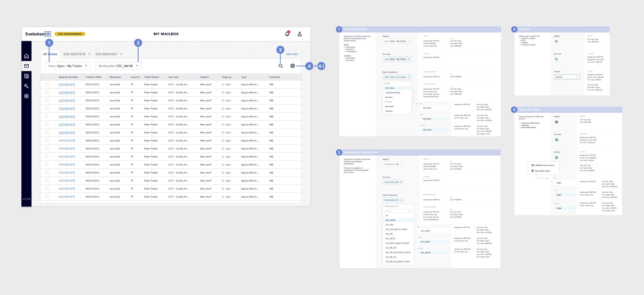
Improved Navigation System
I redesigned the navigation as a compact sidebar, which conserved screen space and clearly indicated where users were within the platform. The new sidebar displayed sub-pages on hover, making it easy for users to access specific sections without unnecessary clicks.
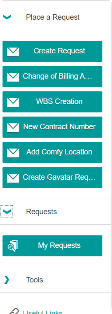
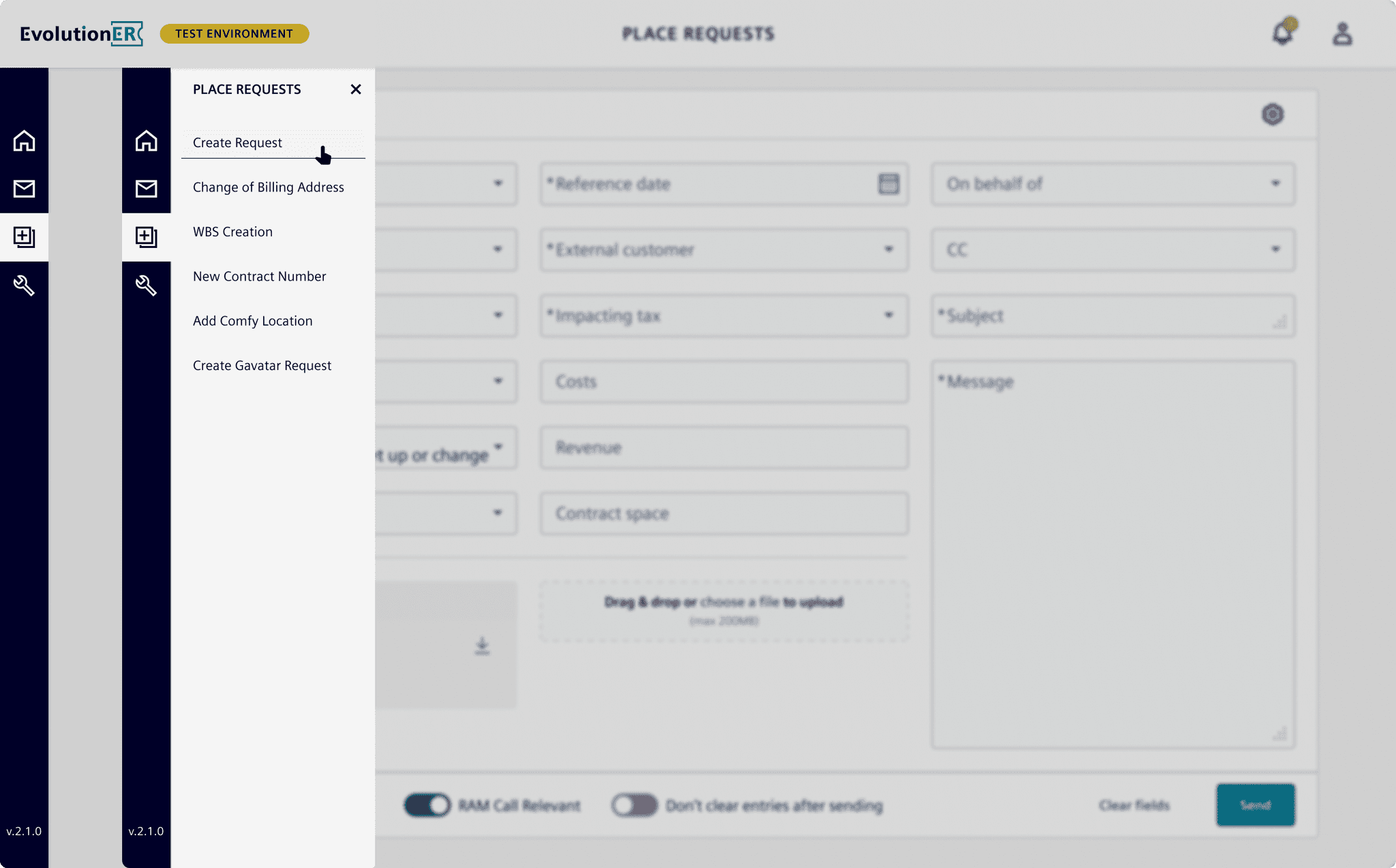
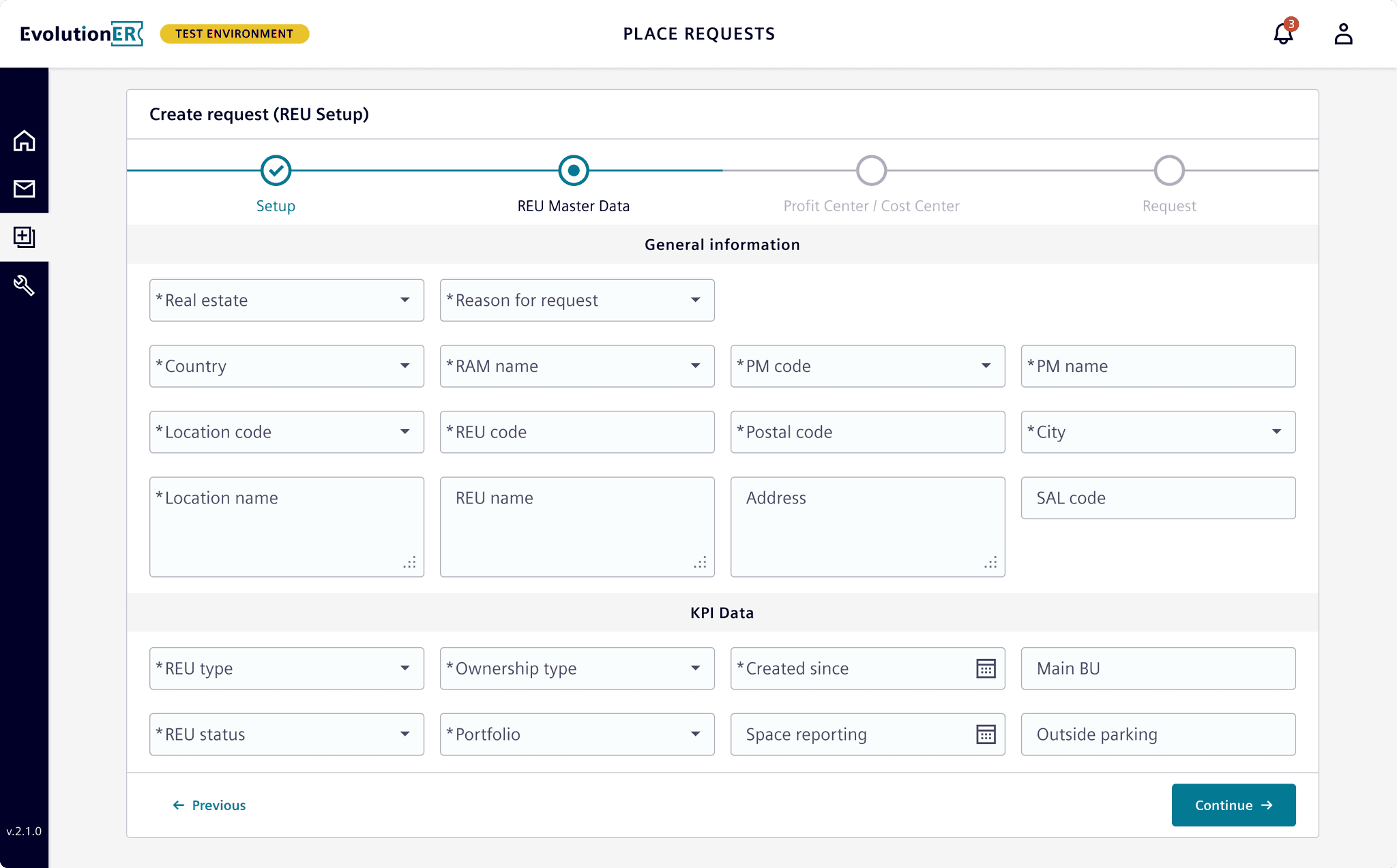
Improved Request Creation Flow
By introducing a dynamic request form, users could complete ticket creation more intuitively. A wizard-style navigation broke the process into manageable steps, each adapting based on the selected use case, helping users avoid errors and complete requests smoothly.
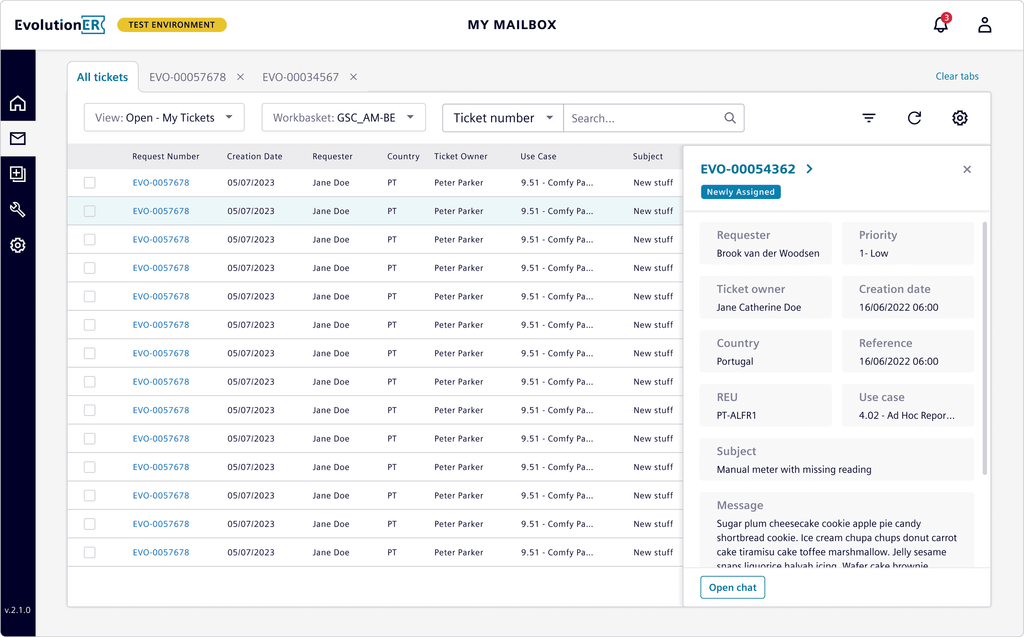
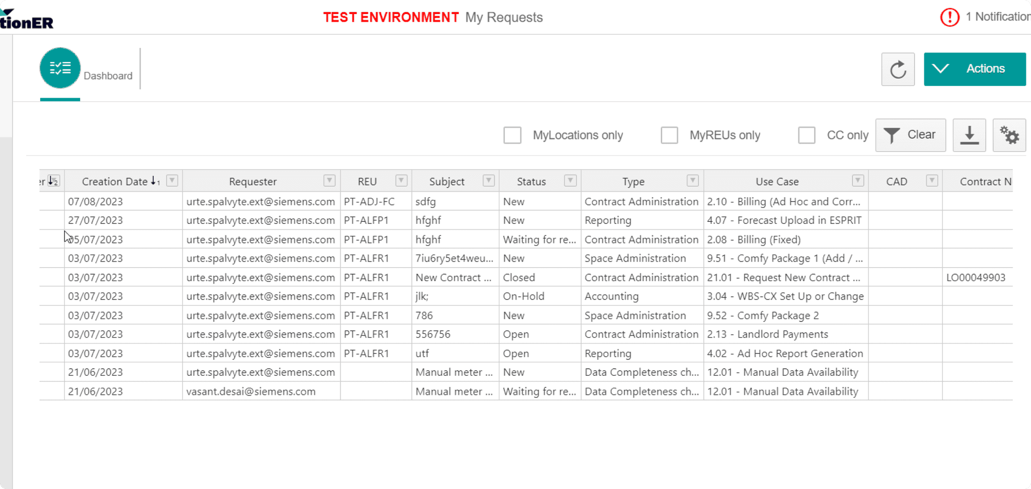
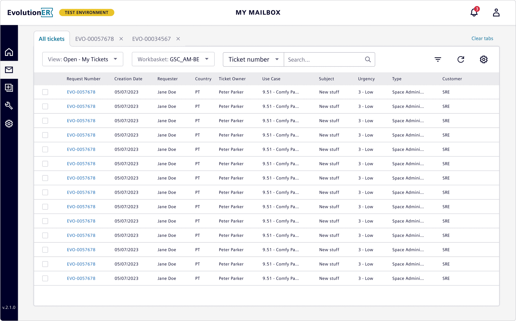
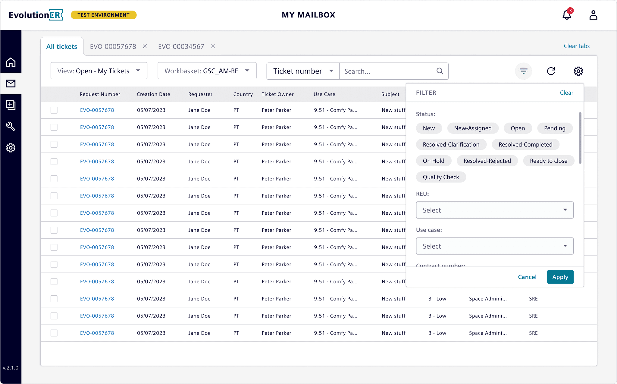
Enhanced Ticket Management Interface
I added a dedicated filtering system to simplify searching for tickets, addressing a major pain point. Users could now filter and find tickets based on multiple criteria, with indicators showing how many filters were applied. Additionally, common actions were moved under a cog icon, keeping the interface clean. A new preview feature allowed users to view ticket details without navigating away, making it easier to manage multiple tickets at once.
Kickoff and Initial Audit
Starting fresh, I conducted a UX audit to map out issues and observed workflows directly. Key issues like inconsistent labels, poor filter visibility, and confusing button placements were documented. Feedback gathered by the Product Manager also aligned with these findings, giving me a solid foundation to begin design work.
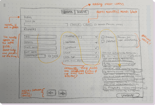
User Insights & Key Pain Points
User feedback highlighted critical areas:
Duplicate Requests: Users often submitted requests multiple times due to missing confirmation messages.
Navigation Confusion: Users found it difficult to locate essential features, which slowed down their work and led to a reliance on support.
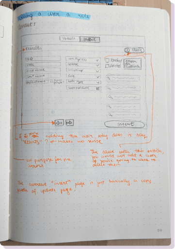
Sketching and Early Concepts
Using quick sketches, I explored several layout and interaction concepts. This was an iterative process with frequent check-ins with the Product Manager and developers to ensure alignment. Key sketches included multiple designs for the table headers and filters, which allowed me to test layout scalability and interaction efficiency.
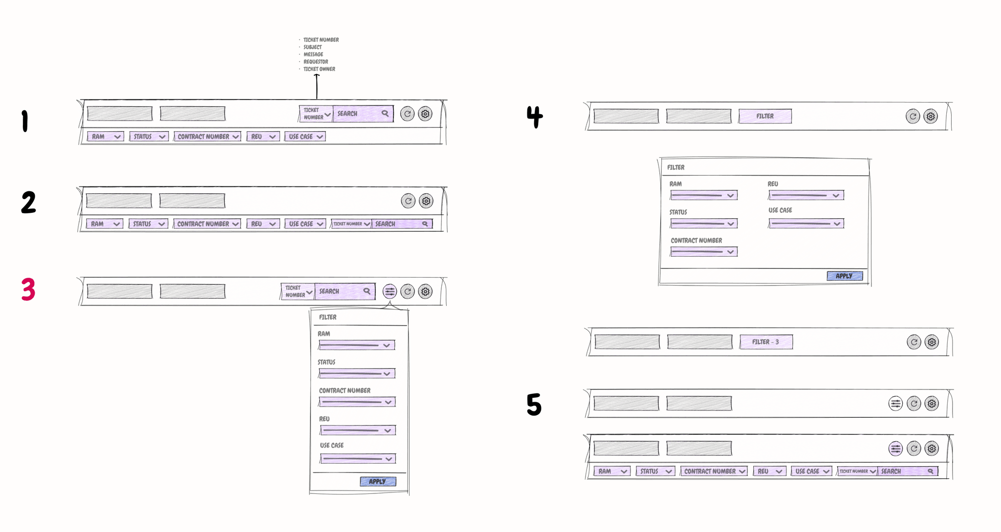
Sketches of filter ideas
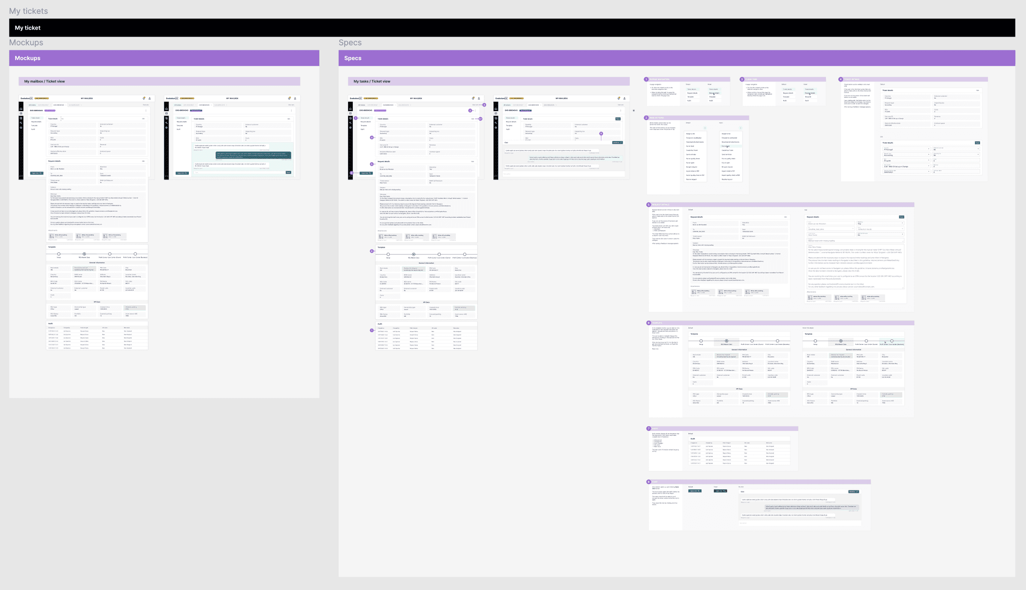
Prototyping & User Testing
After creating initial prototypes in Figma, I conducted usability testing with ticket managers. Testing uncovered that confirmation messages were too subtle and that hiding certain buttons created confusion. These insights led to immediate design iterations:
Snackbar Visibility: Increased color contrast improved visibility for confirmation messages.
Static Action Buttons: Actions were kept visible, addressing user feedback and enhancing usability.
Collaboration and Handoff
Ongoing Collaboration
Throughout the project, I maintained close collaboration with developers and stakeholders. I provided regular updates during stand-ups, allowing the team to give feedback early in the process. This proactive communication helped avoid misalignment and kept the project moving forward without major delays.
Smooth Handoff Process
Using Figma, I created an organized handoff with detailed documentation for each component, including interactions and transitions. This preparation minimized developer questions and ensured that the final design was accurately translated into the product.
Results and Reflections
Stakeholder Feedback
Although the project was completed before full deployment, stakeholder feedback was highly positive. The redesign was noted for its improved clarity, navigation, and task completion flows, indicating that the project was on the right track to meet user needs.
Projected Metrics for Success
If post-launch metrics were available, I would track:
User Satisfaction: Conduct post-launch surveys to capture ease of use and overall experience.
Support Ticket Reduction: Monitor the number of support tickets related to usability issues.
Efficiency Gains: Measure ticket processing times to determine workflow efficiency improvements.